Intuitive Path Academy Website Redesign
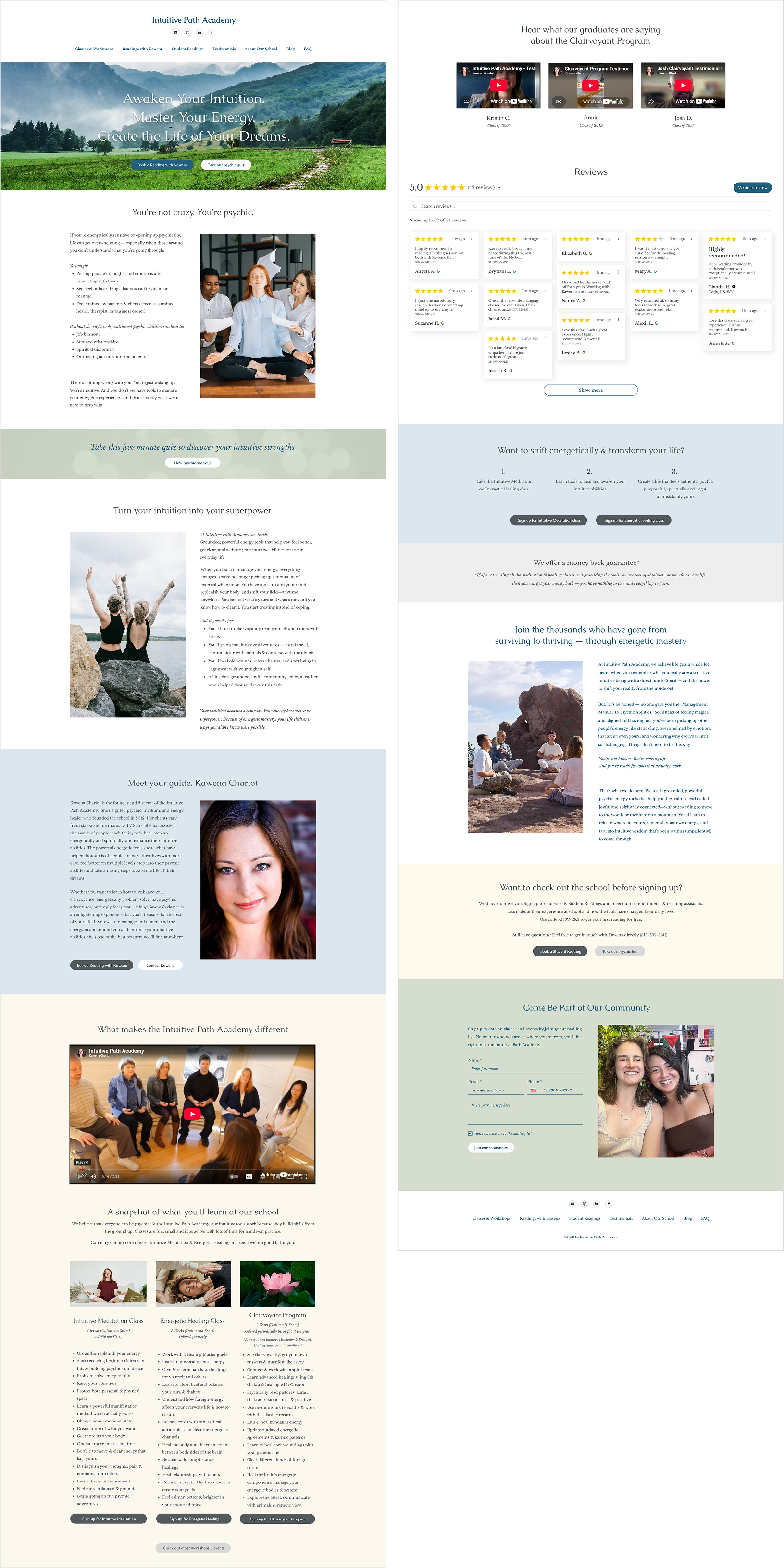
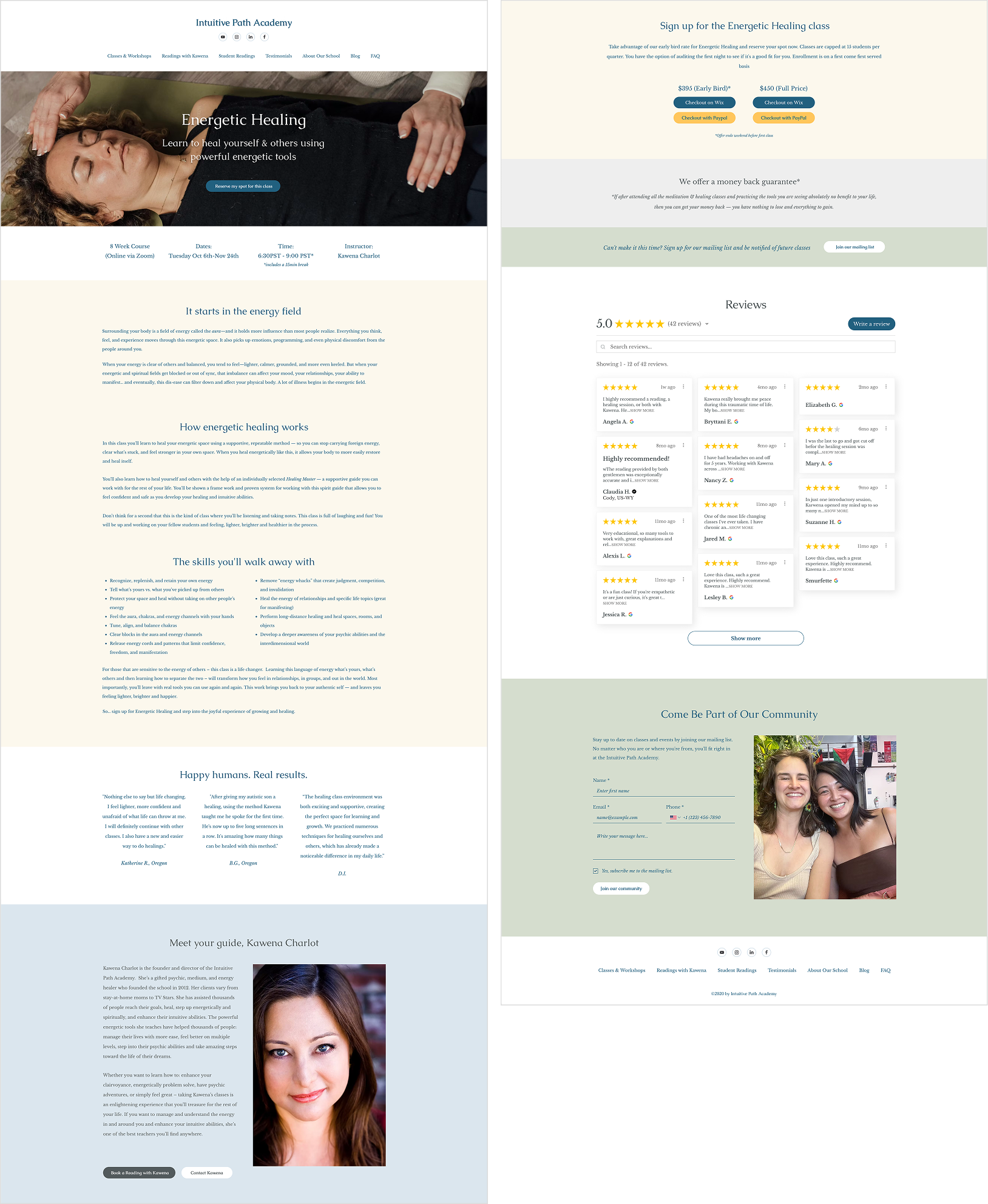
Intuitive Path Academy is a school for empathic and intuitive readers, offering seasonal courses as well as workshops & special events that rotate year-round. I was tasked with redesigning the homepage and 2 other core class pages to have clearer product offerings & touch points for prospective students to interact with the school, as well as adding places to pull in more subscribers. In addition to updating the pages themselves, I standardized the web branding colors & typography and restyled the school logo to make the site feel even more inviting and readable.
I worked closely with IPA founder Kawena to design, build out and update the pages in Wix for this project.
Role Visual & web design & production
Deliverables Homepage, Intuitive Meditation & Energetic Healing class pages, refined site logo & web branding system
Initial Research & Sitemap
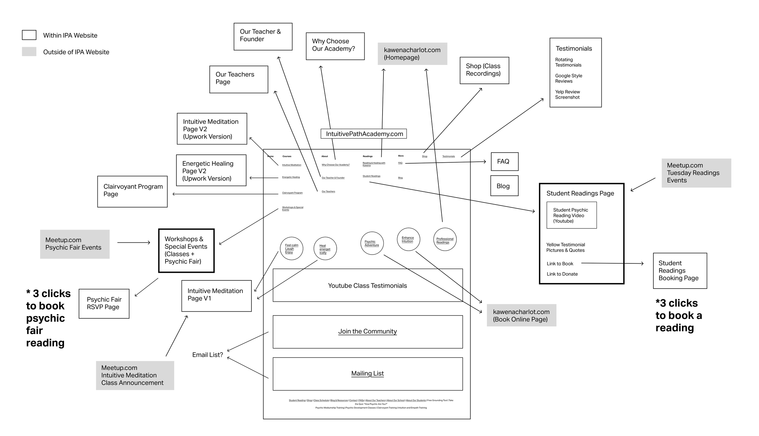
To understand better how to streamline the website, I created a sitemap of the site to track site links and to look at the checkout pipeline. I discovered that:
Multiple old versions of pages were being used, creating informational & visual discrepancy
Student readings were hard to find (took 3 clicks) & buried in the site navigation when they were a huge way to engage with potential students
Hard to tell if professional readings were affiliated with the school
Available classes were buried and hard to find (and took multiple clicks to sign up for)
A lot of links in the navigation could be clearer & combined
Design & Content Opportunities
Make homepage a 1-stop place to educate potential students about school offerings & ways to connect
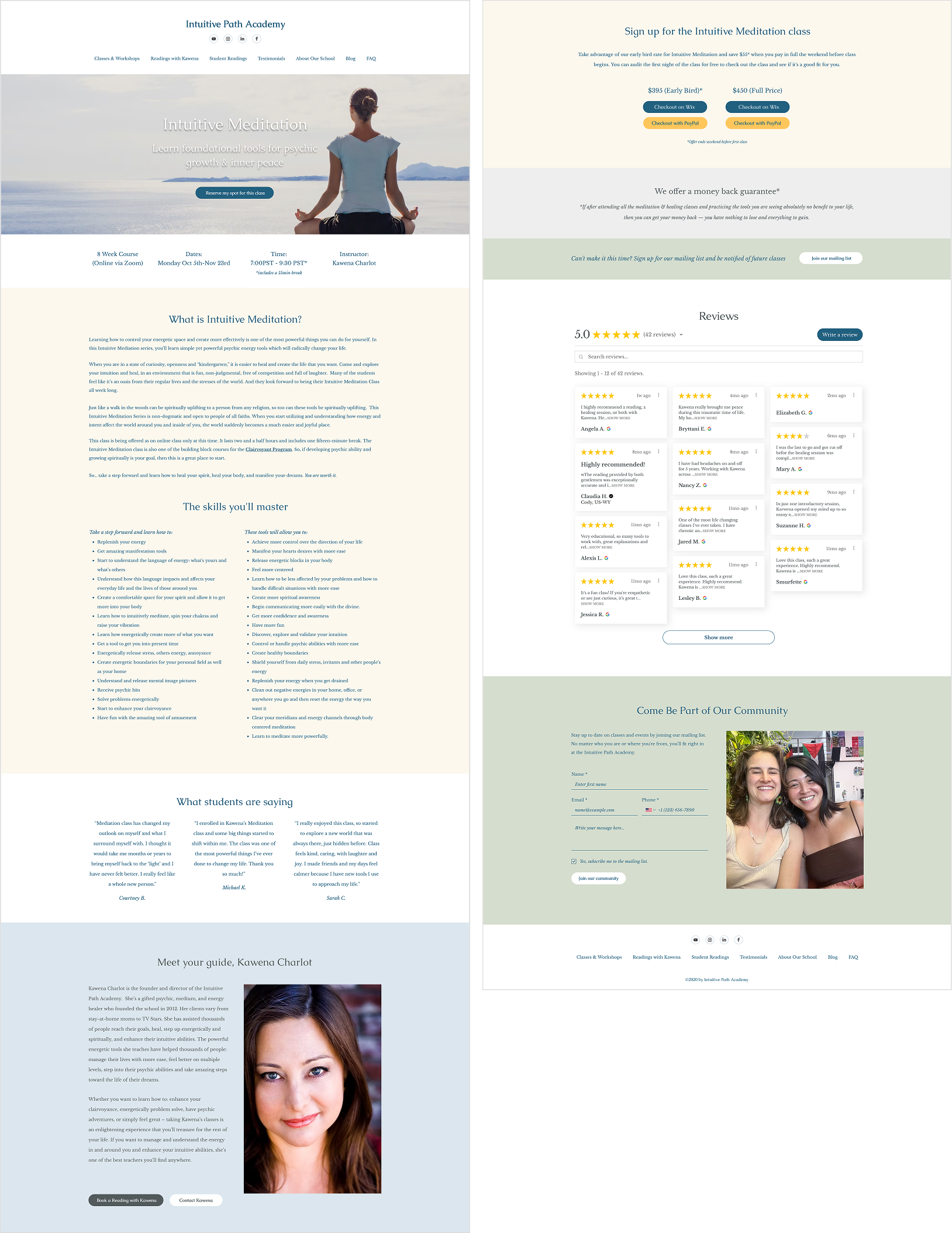
Streamline class page design so it can be a template for future classes
Promote professional readings to help increase side revenue and point to psychic test page to capture more interest & email subscribers
Simplify navigation to eliminate clutter & outdated links
Update branding, site colors typography & imagery to feel cohesive, readable, and communicate’s the school’s close-knit vibe
Highlight social media presence and money back guarantee to encourage prospective students to sign up
Update Google Testimonials widget look & feel and add testimonials from real past students to build trust
Have separate buttons for Wix & PayPal and early bird checkout options
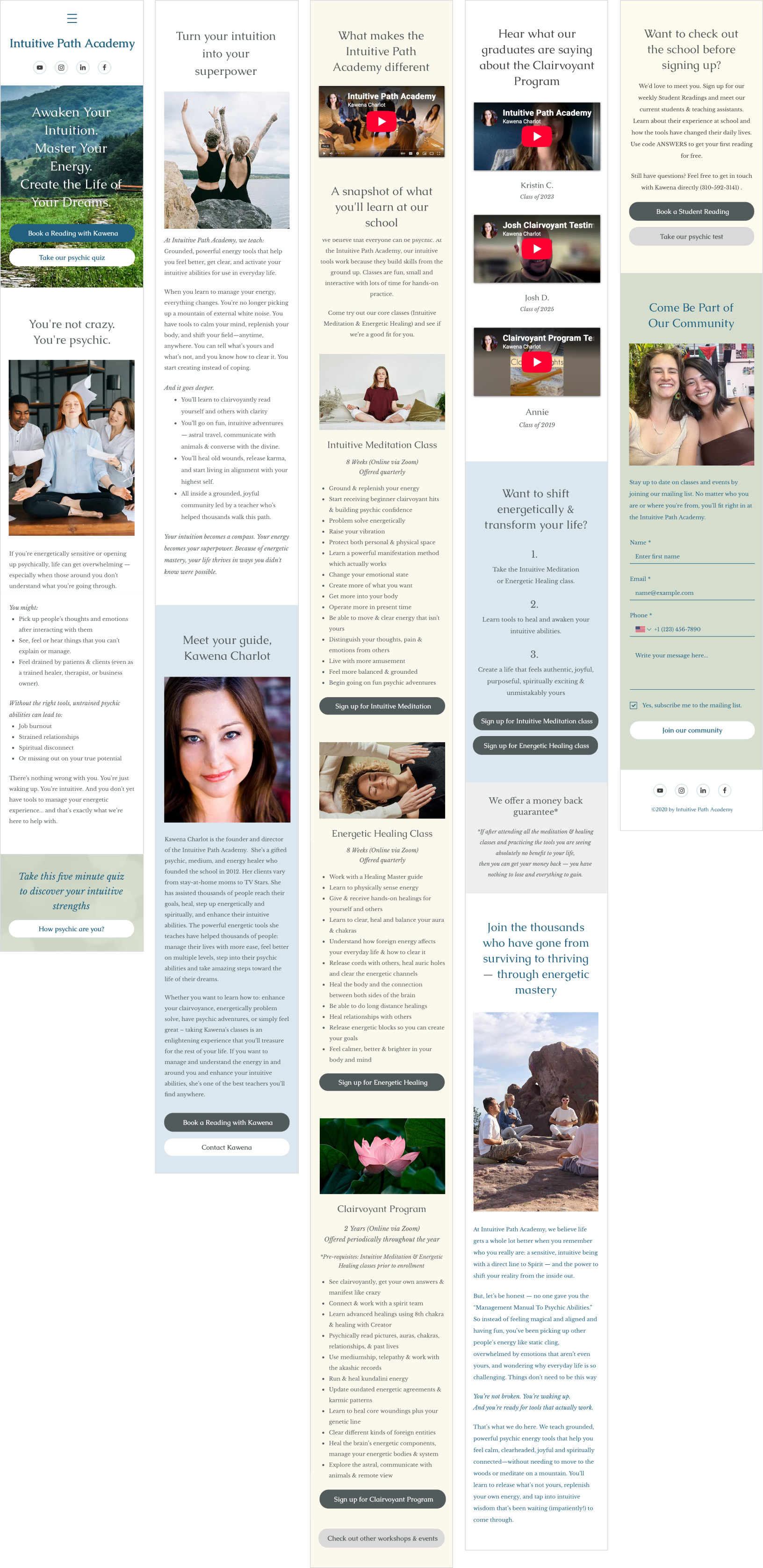
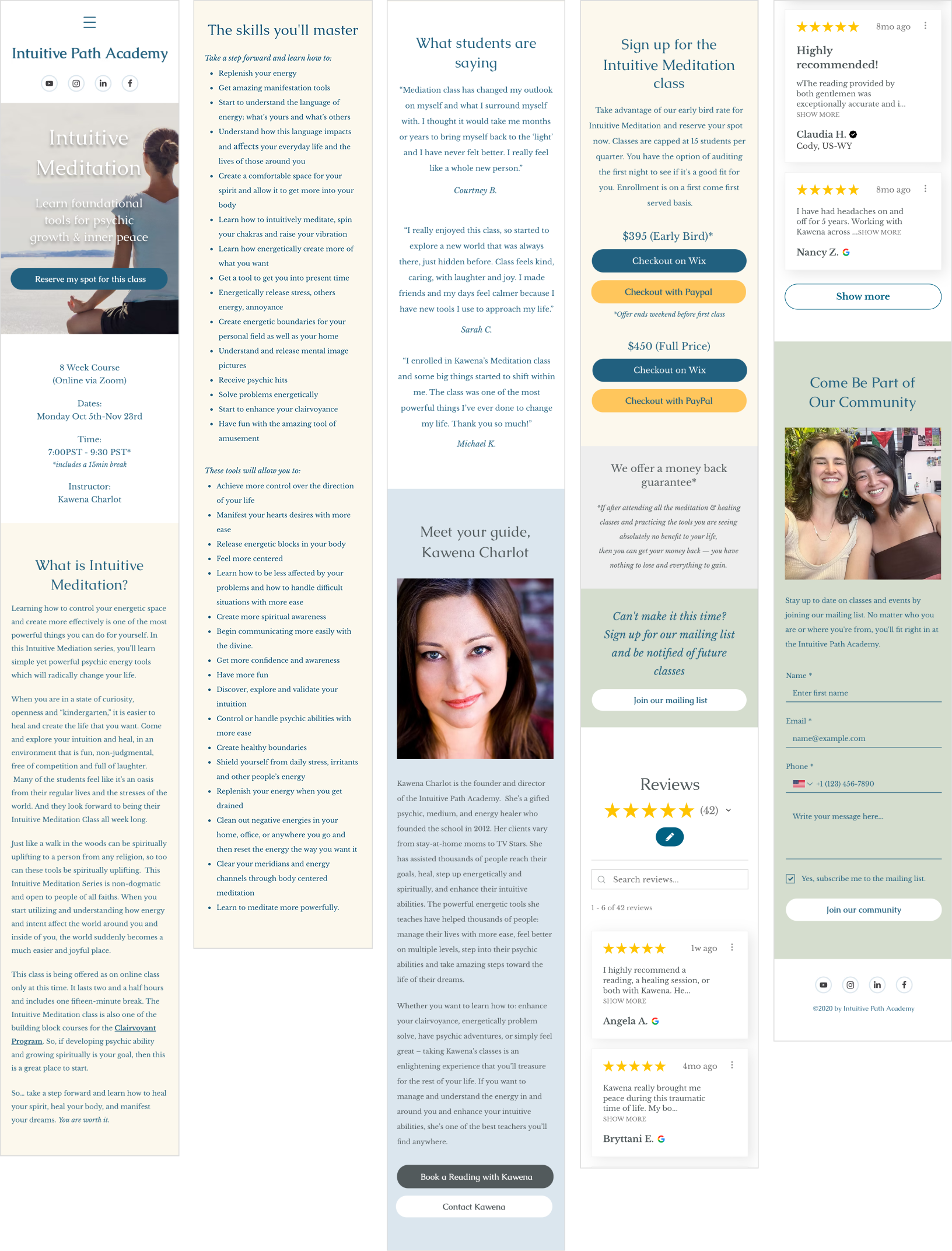
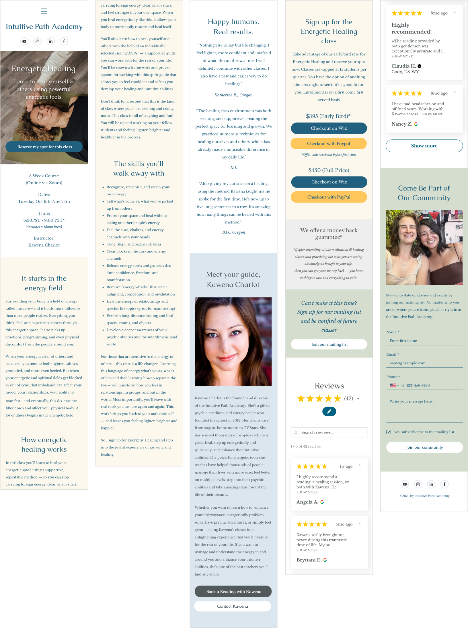
Desktop & mobile design continuity
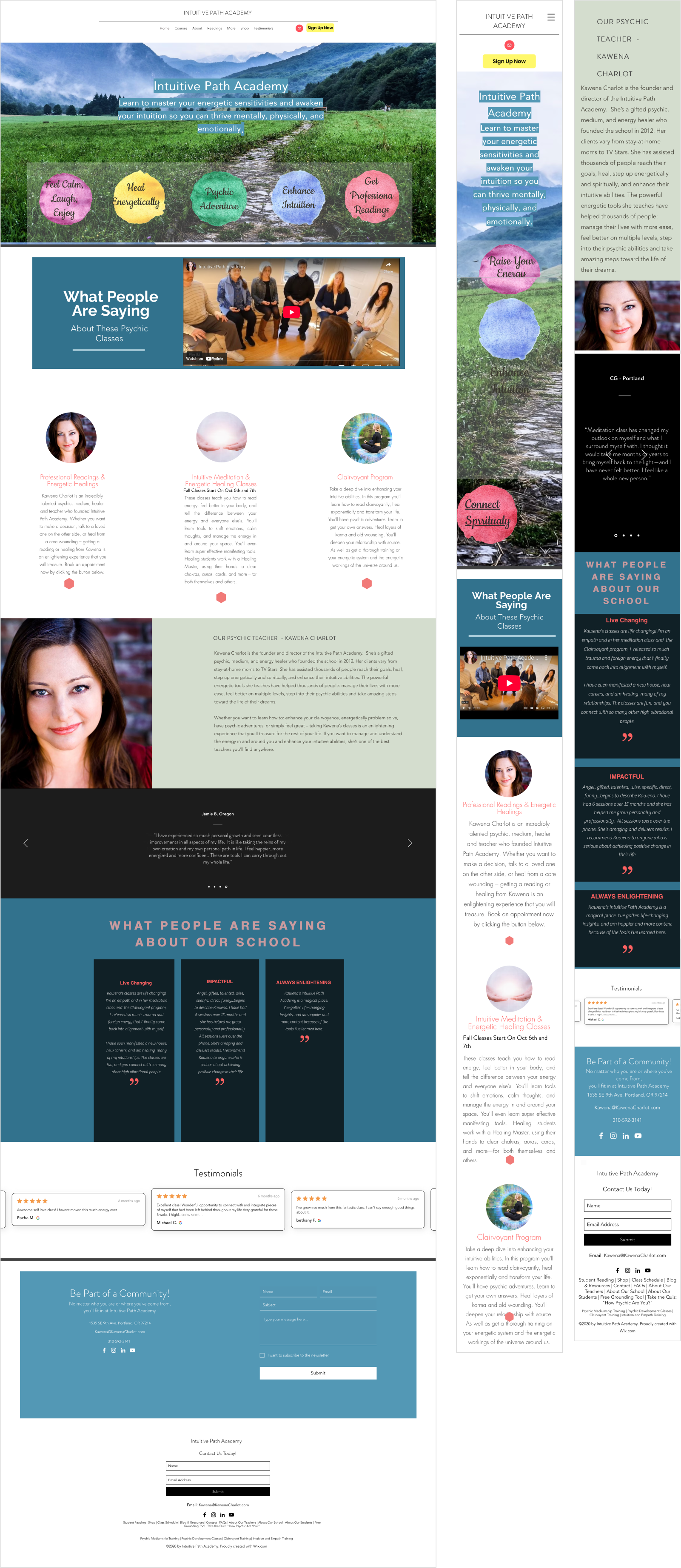
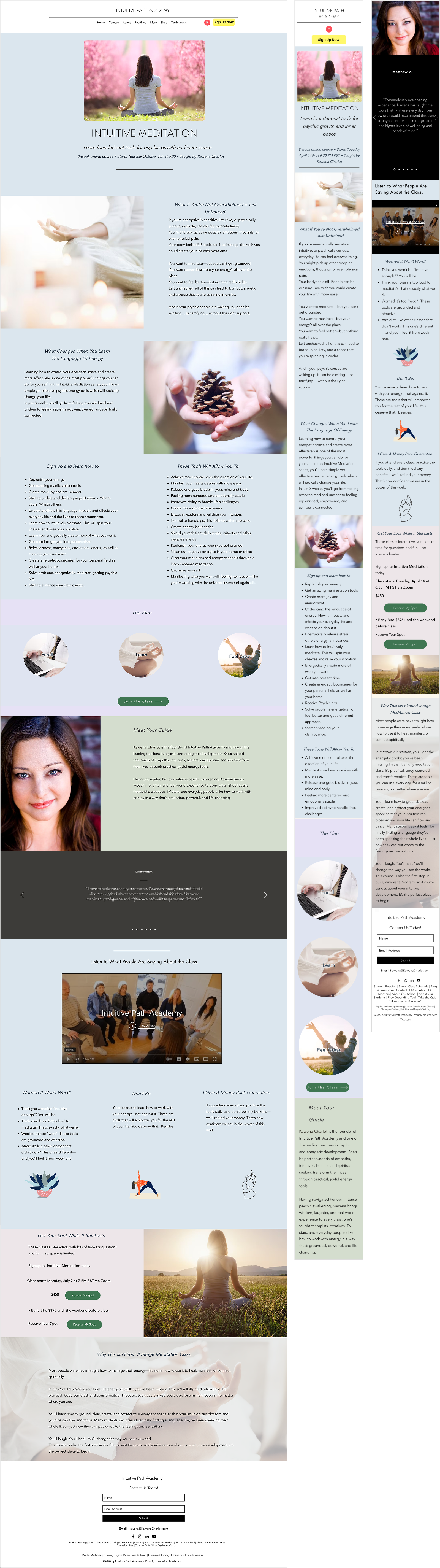
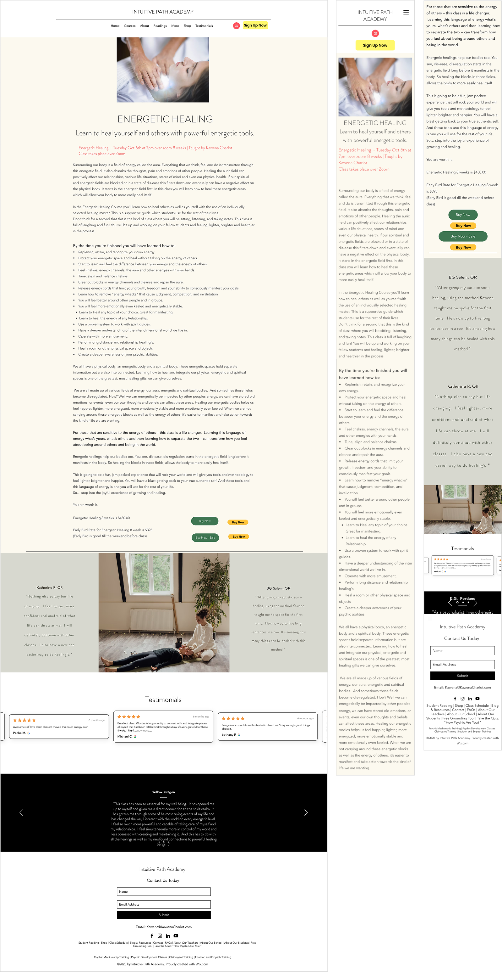
Updated Identity, Typography & Color Palette System
I updated the logo for the school to have a more official & collegiate feeling, while remaining warm and inviting to potential students. In addition, I created a system of colors for backgrounds and typography that could be flexibly used on subsequent pages in the future, leaning on contrast and readability as a guide.
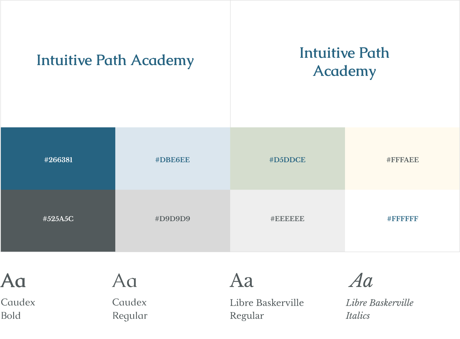
Final Homepage & Class Page Designs